Apex Legends - an interaction system case study
At a glace
Context
Apex Legends is a battle royale first-person shooter known for its fast-paced and hectic gameplay. A major factor in this is its interaction system; this system is used for all player-system interactions, such as picking up objects, building interactions etc.
Problem statement
The interaction system in Apex currently uses one button to interact with all game objects. This leads to many undesired inputs as game objects clash with the interaction radius.
Value proposition
Creating a better interaction system allows for more accurate inputs, leading to more fluid and consistent gameplay.
Team
- 1 interaction designer (me)
Functions
- Interaction Design
- Product Thinking
- Game UX Design
Expected impacts
- improved game clarity
- higher skill expression
- less frustrating system interactions

Organizing Current Interactions
One button sure does a lot of things
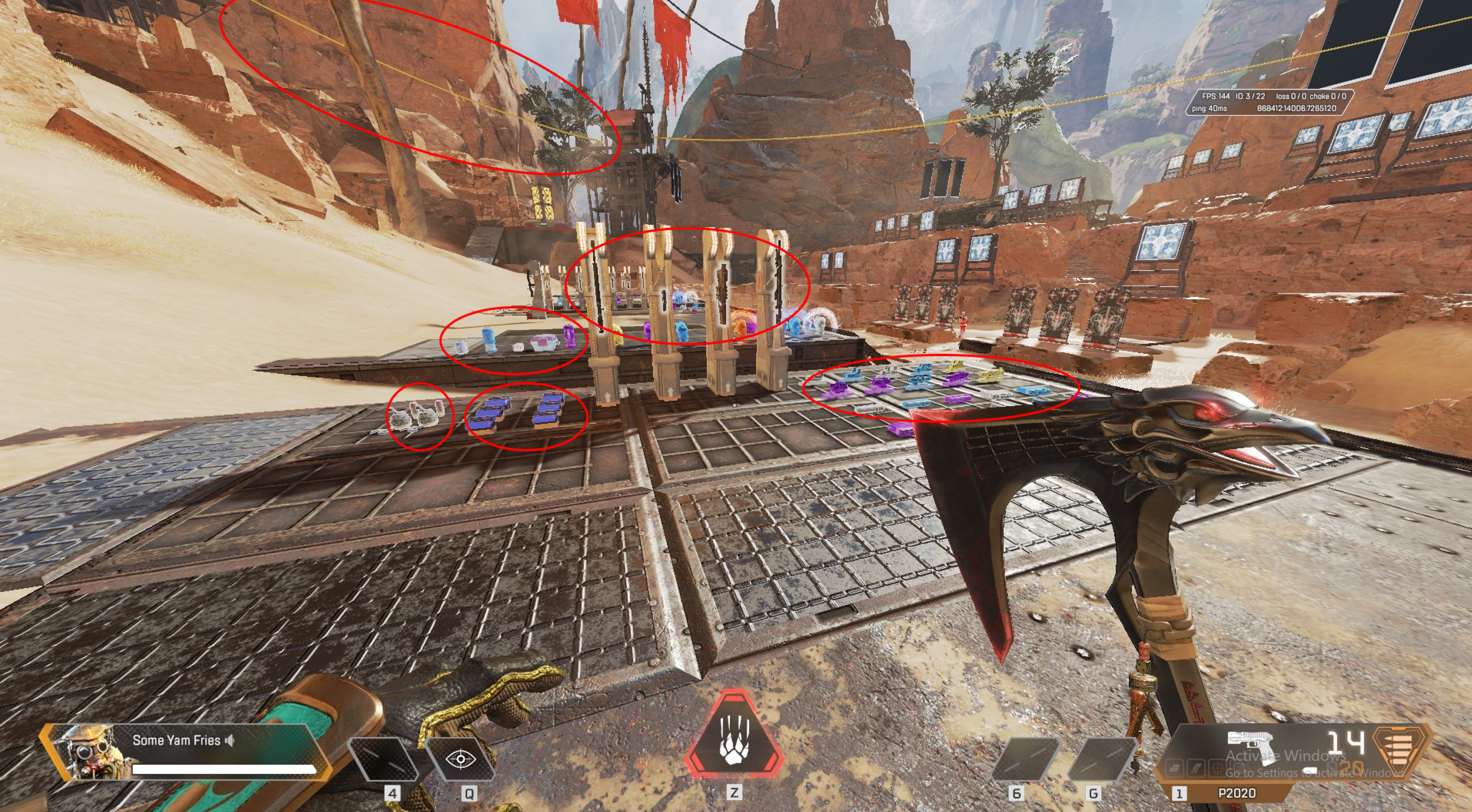
As seen in the image above, everything circled in red is interactable (with some missing objects such as vehicles, doors etc.). However, they all use the same interact button, so if these objects are near each other, it can create a lot of confusion. My first objective was to try and sort these interactable objects so more than one key could be utilized, helping reduce the confusion and frustration that can occur when trying to interact with closely placed objects.
Combat
- Weapons
- Ammo
- Ordnance
- Death Boxes
- Revives/Respawns
Non-Combat
- Doors
- Banner Collection
- Beacons
- Ziplines
- Vehicles
After some brainstorming, I thought 2 categories (combat and non-combat) would be best as it separates interactable objects into distinct categories, and doesn't make the interaction system more complex than needed. I chose these categories for a couple of reasons: the majority of interaction conflicts occur when a combat and non-combat object are close together. For example, when you're trying to open a door and pick up a weapon instead!
Implementation of New Clusters
Finding a home for our new interactions

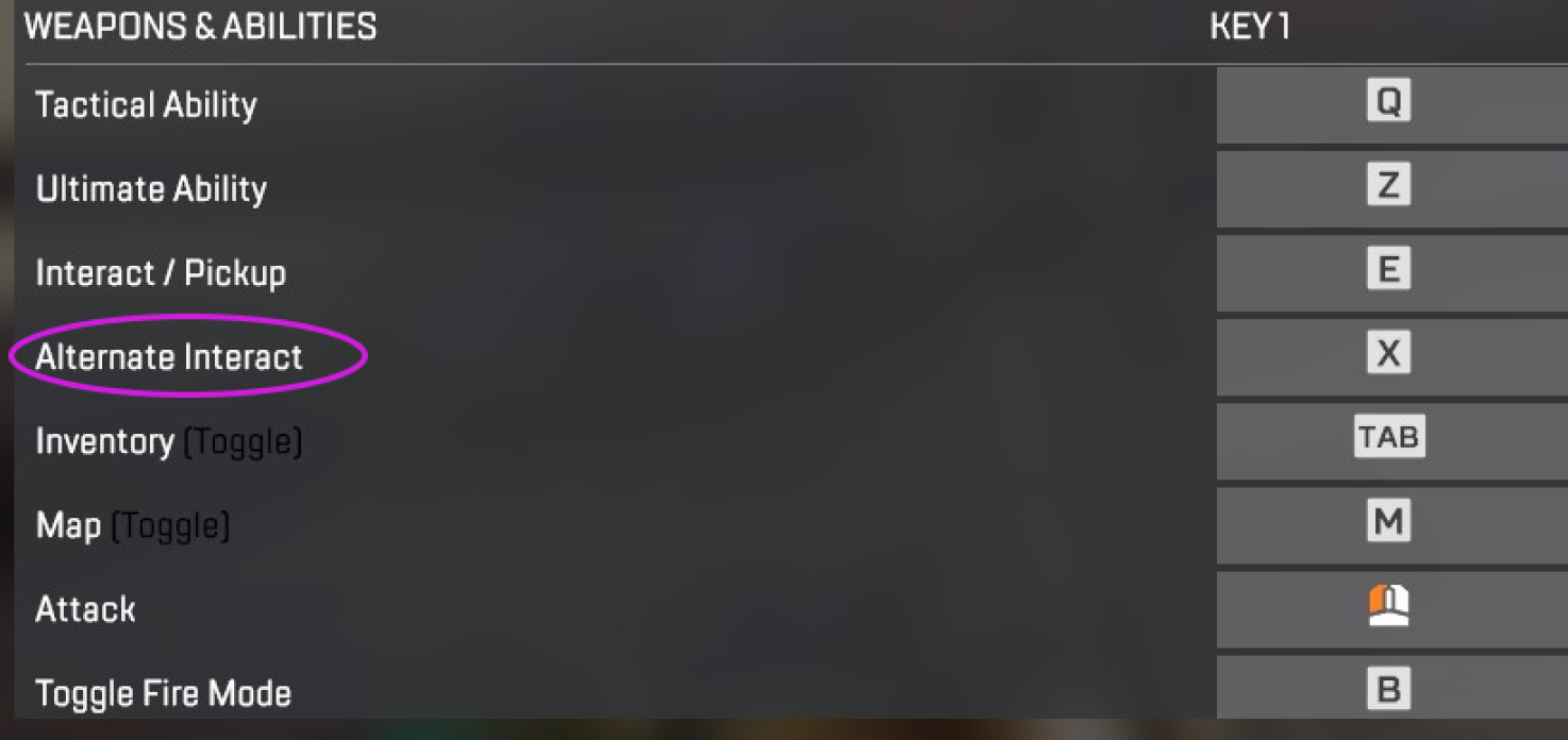
Like most video games, finding a new keybind that's both ergonomic and available isn't the easiest. Luckily for us, Apex Legends already has a dedicated option for an alternative interact key. This makes the job a lot easier, as one of the clusters can just be set to the alternate interact button, with the other cluster remaining on the default "e" key. One possible issue with this would be the removal of the alternate key, requiring another alternate to fill its place. However, I think the benefits of having a more organized interaction system would justify the tradeoff of power users needing to adjust to another keybind.
Decreasing the Radii
What happens when objects in the same cluster are close together?

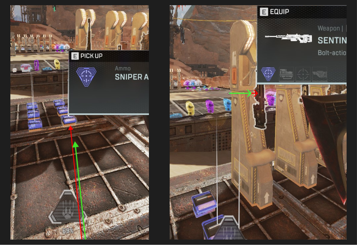
This is a tricky area to balance since radii too large can lead to undesired inputs, and radii too small can lead to missed inputs. I think a very minor reduction in radius around the character model and around the crosshair, combined with the new interaction keys will help reduce the current issue of undesired inputs without leaning too far towards the other side of the spectrum where inputs are missed.
Learnings and Reflection
Complexity is a double-edged sword
Sorting the interactions was definitely the hardest part of this process. When I was originally thinking of solutions I found myself overcomplicating game mechanics and trying to make things as specific as possible since I thought the current system was too simple. After looking at the logistics of how many keys you could reasonably allocate and the additional learning it would take to adapt to a new system, I realized any more than 2 categories would just make things worse. The problem wasn’t that the system was too simple, it was just that it needed a bit more clarity. Reflecting on the system, I think its simplicity is a huge benefit to the user experience, and adding an extra key doesn't take away from that, it just provides some additional support to the system.
Sometimes it's hard to tell if what you’re looking at is actually a problem, or if it’s just that you’re the problem. I have over a thousand hours in Apex and I was still unsure about whether this was a real problem. This is where research comes in; talking with players in-game and reading Reddit posts and articles not only reassures that you are looking at a real pain point but also provides massive insight into possible solutions and the subtle details of why something is an issue.