Customer Relationship Management Dashboard - compiling data into one cohesive platform
At a glace
Context
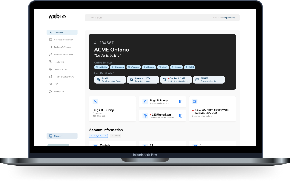
Corporate WSIB approached the innovation lab to create a dashboard experience that compiled information about employers to create an easier experience for WSIB employees. Currently, this information is found in a variety of different sources such as spreadsheets and other software applications.
Note: Due to the nature of some of the data within the dashboard, it has been replaced with dummy data, with particularly sensitive fields omitted :).
Problem statement
How might we create a CRM dashboard that compiles a variety of data fields while still providing users with a familiar and simple experience?
Value proposition
Creating one unified dashboard for employer information allows WSIB employees to quickly identify all aspects of an employer, creating a streamlined flow for handling core processes, and faster completion times when assisting employers.
Team
- 5 designers (including me)
- 4 developers
Functions
- Accessibility
- Visual design
- Usability Testing
- Interaction Design
- Mockups and Prototyping
Expected impacts
- less confusion and contradicting data between different teams in WSIB
- quicker task completion times for WSIB employees
- simplified experience through the use of one comprehensive platform
Background and Preparation
Getting up to speed in a dash(board)
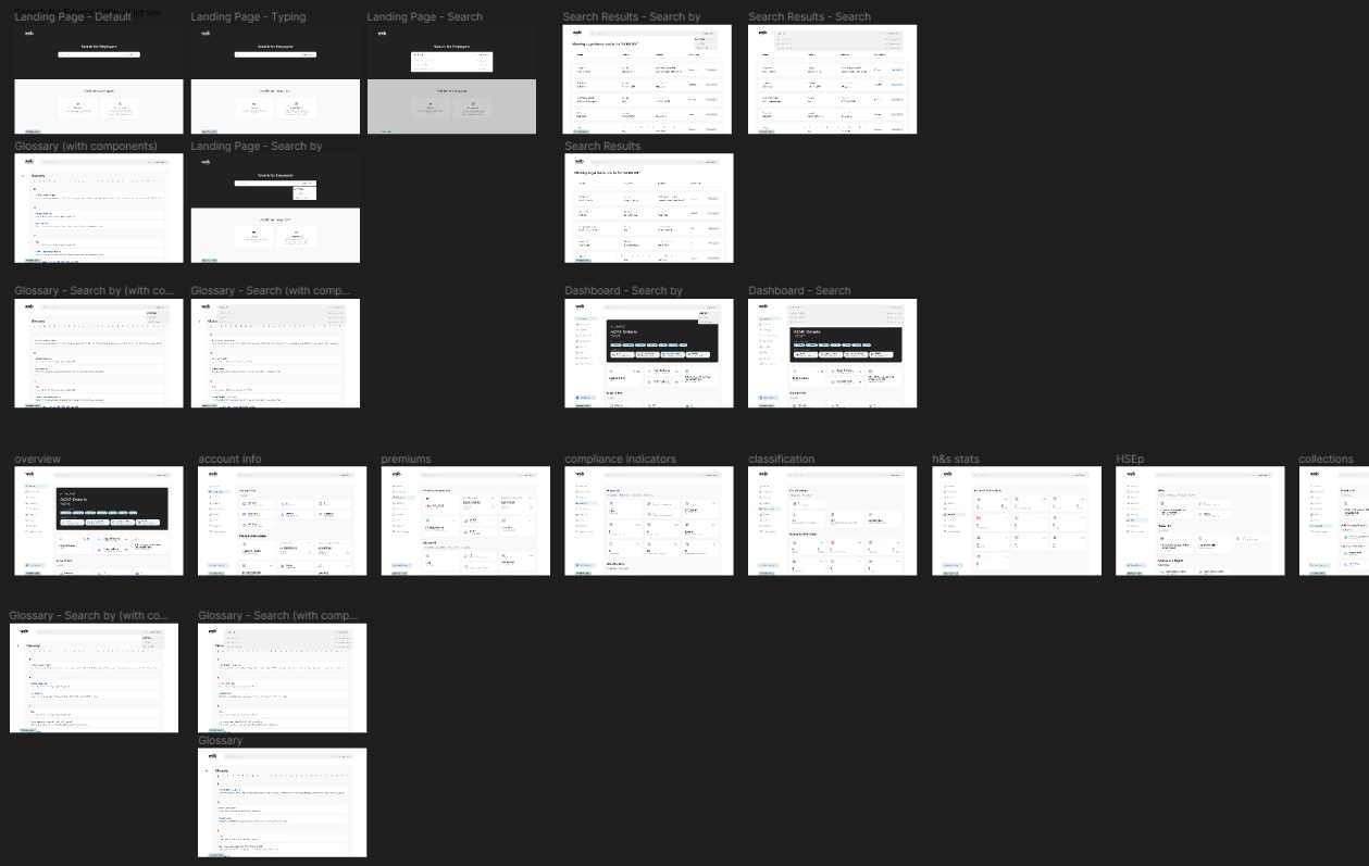
Our team joined this project about halfway into its projected timeline, so we were carrying over work from the previous team. We got up to speed with the project timelines, mockups, and documentation. Our first task was to prepare the mockups that were created for usability testing. We had interview sessions planned with different teams within corporate WSIB to gain insight into different aspects of the dashboard, such as its ease of use, features, and overall opinion of the structure and content.
Usability Testing
The challenge of conflicting opinions
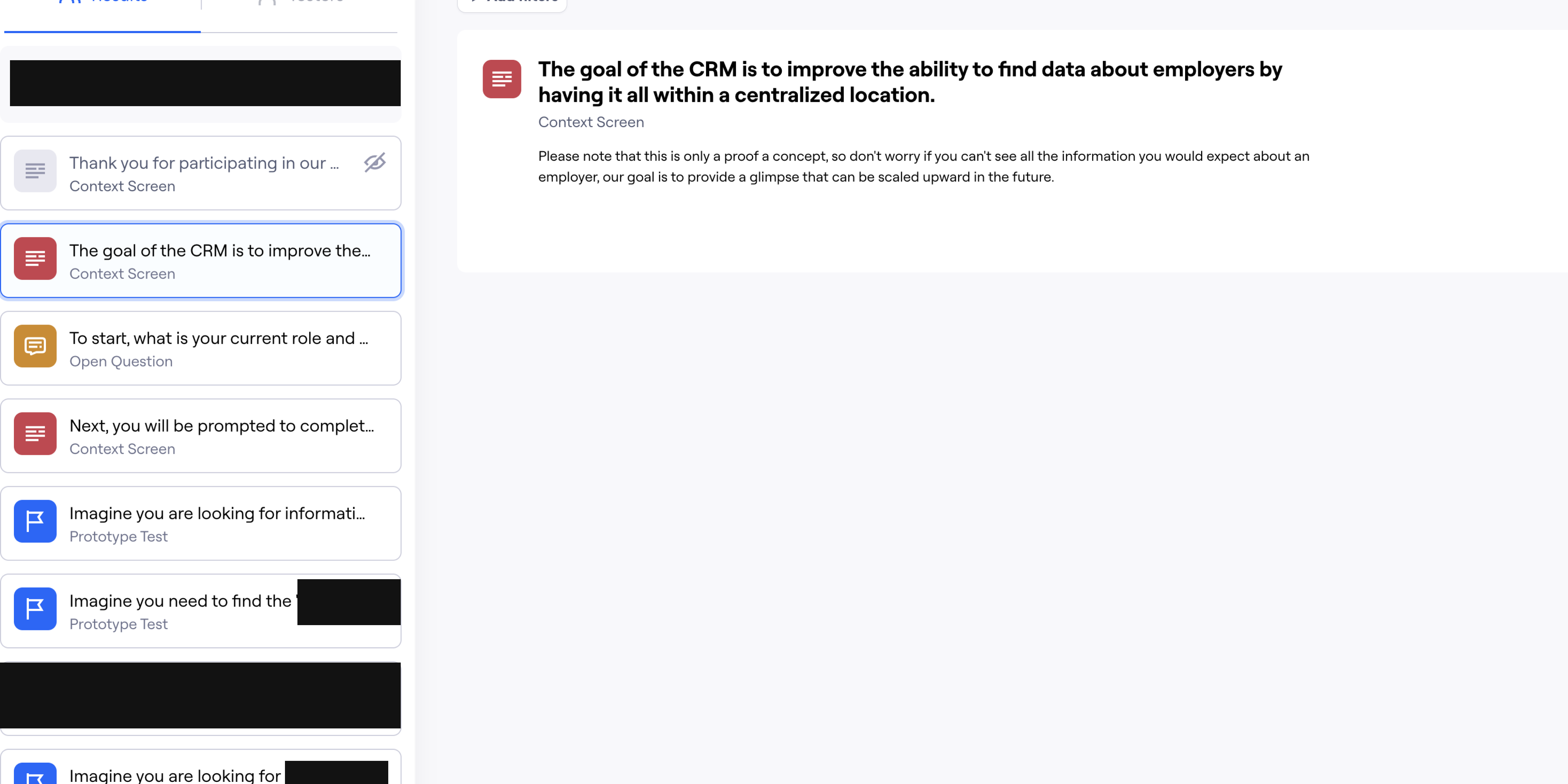
We planned to perform two methods of testing: user interviews, and an asynchronous testing session using Maze. Our user interviews had more qualitative questions, as we could easily prompt users on specific areas and have more time to learn about their thought processes and pain points while interacting with the prototype. For the Maze session, we focused heavily on KPIs such as the completion time and error rate while completing tasks, as well as looking at heat maps to analyze key areas in the dashboard.
Key Insights
1. Some categories should be regrouped together to better reflect the content flow of the dashboard. For example, placing the company address alongside its general information, and placing information pertaining to different teams near each other.
2. The search bar should have more functionality, such as for phone numbers, and glossary terms. Users were also confused about whether it was a universal search bar, or page specific.
3. A majority of users struggled to locate a company that had similar names within our Maze testing, with this task having the highest drop rate.
4. Some terms and acronyms were either not used or had different names depending on the team, leading to confusion and misunderstanding amongst the participants.
The general consensus from our testing sessions was that the dashboard was useful, but the specifics on how it would be useful varied greatly between individuals across all teams. We noted multiple conflicting opinions, such as how some users prefer the current system and would have a hard time adjusting, but newer users would find the glossary and compilation of data helpful, or the amount of information that should be included; for teams that use the information, more detail is preferred, but that ends up being visual clutter for other teams who skim past it.
Mockups, Prototyping, and Handoff
Taking it live! (after implementing some improvements)
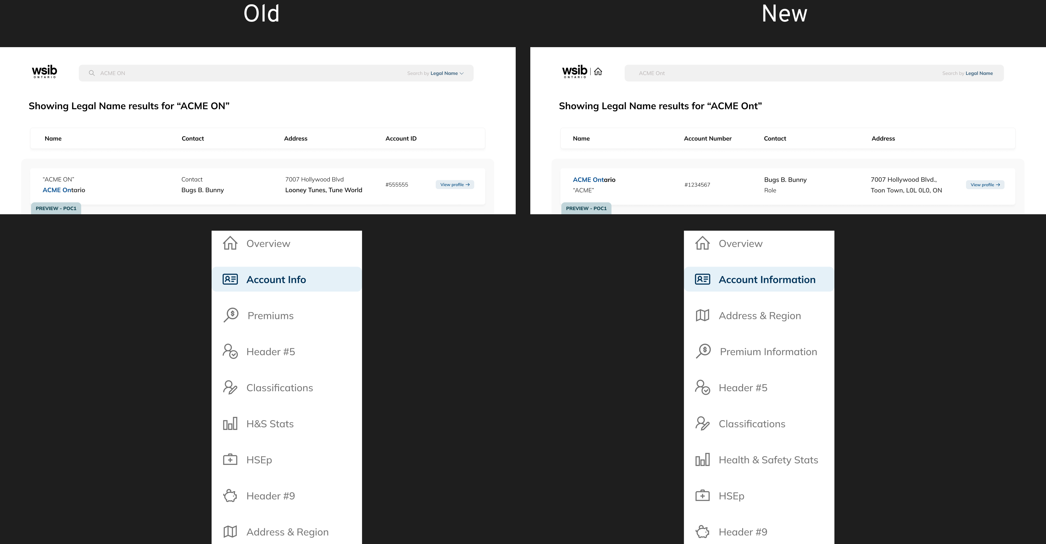
Applying our insights from our testing, we made some final touches to the dashboard. Some of the changes made were to expand all acronyms, as well as address alternate names within the glossary and rearrange data fields to create a more intuitive flow for different teams. We also implemented solutions to address the conflicting opinions we noted during our user testing. We were able to get some examples of current internal software used by our participants to reword or reformat fields in the dashboard, making a future transition to the dashboard easier, and creating a half-page design to accommodate more use cases, such as the dashboard being used in conjunction with a spreadsheet.
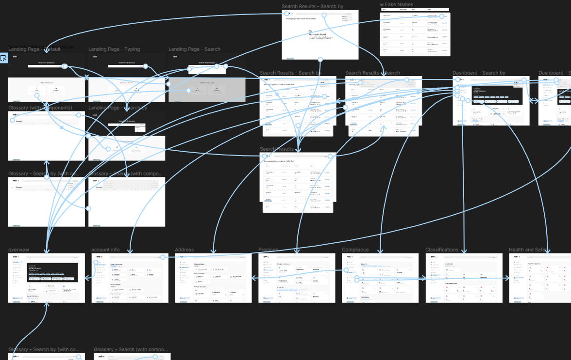
After wrapping up the final mockups and prototype. The design team gathered all our resources and prepared for handoff to the development team. We noted a list of interactions, such as hover states, scroll features and animations. We also noted the additional features that were not possible in the prototype due to Figma limitations, such as having anchor links for the sidebar alongside the hover states. Once the developers completed the live version, the PoC was sent to our stakeholders, marking the end of the project.
Learnings and Reflection
How do you make everyone happy?
Reflecting on this project, the short answer is that you can't, but I learned that listening to all sides has immense value in itself, even if you can't feasibly implement everything you capture. For example, one of the biggest pain points we found when performing our usability tests was a simple issue but hard to solve; each team had their own terms for the same pieces of information, so which terms would we go with? We had many different ideas; using the glossary to highlight synonyms, having the different terms appear on the dashboard itself, and seeing if one term could be standardized across different teams. Eventually, we looked at the frequency and use cases for the terms for each of the teams; since we were compiling a wealth of data, we found areas that some teams rarely interacted with and decided on naming conventions that matched the team who used the data the most. Furthermore, we also leveraged our glossary to list alternative names. It wasn't a perfect solution, but we wouldn't have realized this pain point if we didn't consider the opinions of each of the teams.