AR Simulations - exploring augmented reality use cases within the military
At a glace
Context
During my time at Defence Research and Development Canada, I worked on a research experiment examining the effects and use cases of augmented reality within the field.
Note: Due to the sensitive nature of the visuals in this project, I won't be showing any images from the actual simulation. Instead, I created some alternate visuals using Figma to help explain the process :).
Problem statement
How might we explore augmented reality use cases within the field to test its effects for pathway marking, navigation, and reconnaissance, measured through the accuracy of target detection and time of completion?
Value proposition
Implementing augmented reality can create safer environments for soldiers by providing more information, leading to higher confidence levels, and faster completion times for missions.
Team
- 1 level/UX designer (me)
- 1 Unity developer
- 2 defence research scientists
Functions
- Interaction Design
- Game/Level Design (Unity)
- User Interviews
- Research Methods
Expected impacts
- more accurate identification of potential targets and threats
- faster completion times for recon trials
- easier navigation while moving between markers
Initial Research and Project Scoping
Getting up to speed to create "unity"
When I joined the team, this project had been going on for about a year; most of the back end was already developed, and my supervisors, the research scientists, had mapped out what they wanted to test within the experiments. My role going into this project was to design the different levels that would be used for experimentation; focusing on making these trials as realistic as possible, while still allowing for good data to be obtained.
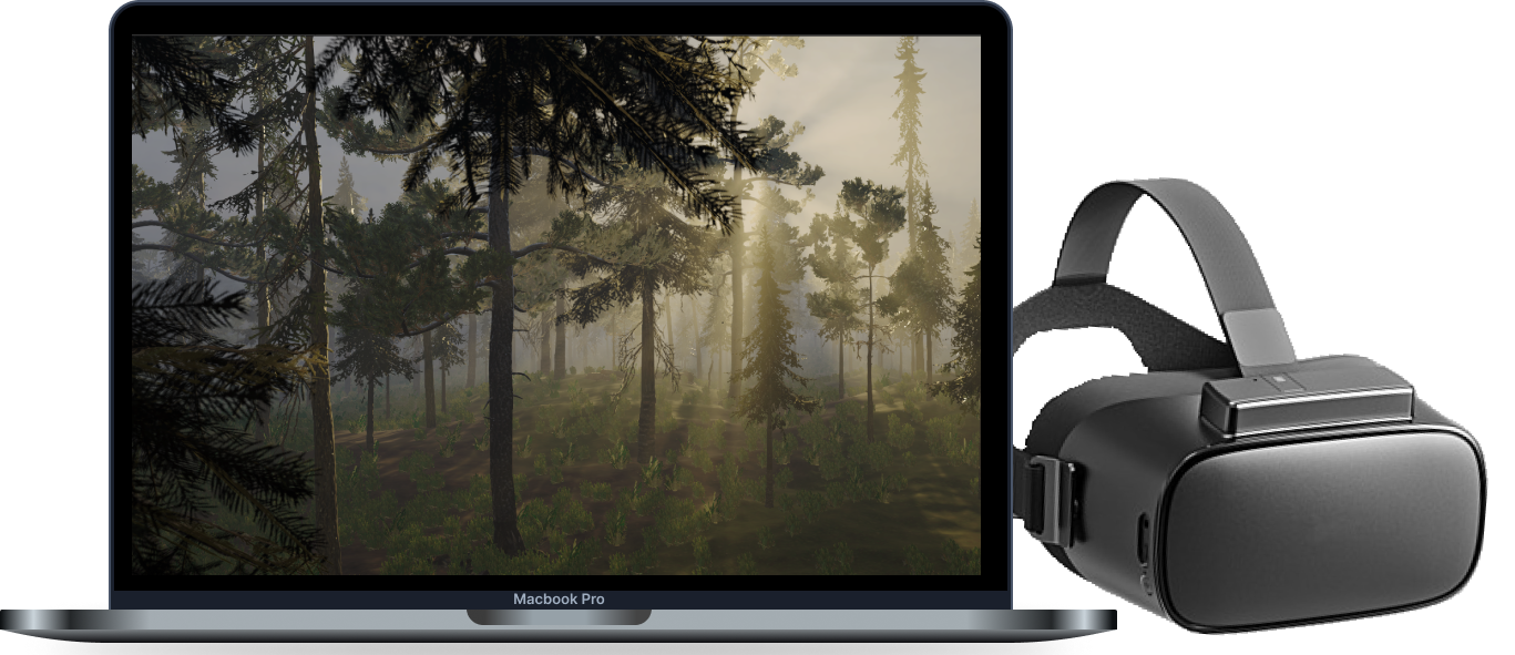
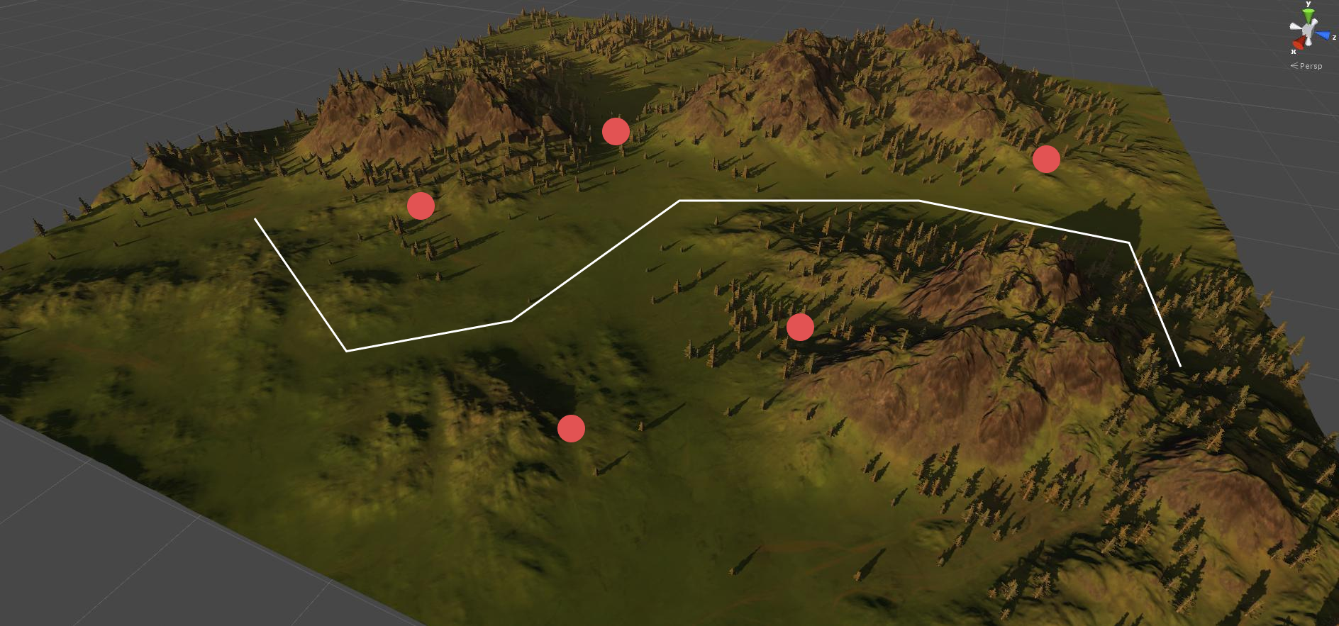
To get up to speed, I play-tested the current version of the simulation, and familiarized myself with the documentation and research plan. Since we were running the experiment using VR, I also set up some VR equipment so I could run tests on my designs later on and see what the participants would see. The team set a 1km x 1km restriction for each level since our in-game model was created to mimic a walking pace. Each level would have guide markers for participants to follow as well as hidden targets that would need to be identified as they progressed through the terrain.
Lo-Fi Mockups
Creating a game that looks straight from the early 2000's
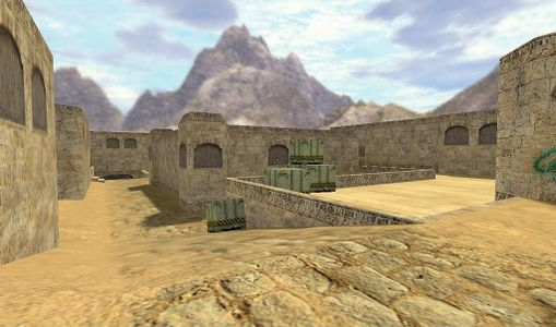
Now that I had the project fundamentals down, I started exploring my options for world-building. I used free third-party Unity assets alongside Unity's built-in terrain feature to create basic levels in different environments; Initially, I fleshed out 4 different levels, each with a unique rural terrain. They varied in height, object density, and opacity to help test the augmented reality elements in a variety of situations. They contained set markers, different targets, and an overall path that each participant would follow.
Since these were "lo-fi" designs, the main focus was on functionality; making sure the game rendered all the different environment aspects properly (my very first design had some floating trees and places where you could fall off the map), and that the built-in data readers were getting accurate information while users were walking through and completing tasks.
Mi-Fi Mockups
Making the game look a bit more modern + research compatible
After getting feedback from my supervisor, I started adding the final, more complex AAA assets to replace the free placeholders I had used to experiment. The most important piece of feedback I got was to make sure my designs were standardized to ensure they didn't influence the data. I was in the Air Cadet program for about 6 years, but most of my experience with military scenarios still came from video games, so my perception of what to include in each level was very skewed. I definitely needed to tone down some of the features in my designs. For example, in one of the lo-fi mockups I put a mountain to scale, but this would've led to way too many variables to account for and I worked to scale back any aspects that I thought would deter from the main objective of the simulation, which was to accurately identify targets and follow a set path.

User Testing/Interviews
Learning the ins and outs from actual reconnaissance soldiers
Ideally, I would've done user interviews before I started designing any levels, but since that wasn't possible, I decided to use these sessions as both a place to gather information about real field operations, as well as for usability testing. These sessions were my favourite part of the project; not only did I get a lot of great feedback about my designs and small nuances that would help with the realism, but I also learned a lot about the field and how operations ran. There were a lot of really cool stories and it definitely helped me not only understand the physical environments they worked in, but also the psychological aspects of missions.
Key Insights
1. Movement is heavily based on the terrain; the more cover is better.
2. Target distance is essential for realism; the larger the target, the further it should be.
3. Waypoint markers should be placed at a roughly equal distance and within areas that are intuitive to traverse.
4. There are certain patterns that soldiers tend to follow in the field, using these patterns would help make our participants more comfortable and would bring more focus to the goals of the experiment, rather than analyzing their walking patterns.
Hi-Fi Mockups
Adding the finishing touches
After compiling all the great insights I received from the interviews/testing and creating a list of action items, I started implementing them. I added some better tree line structure to match the pathways; as you can imagine, if you're trying not to be seen and looking for targets, using cover would be smart and making the trial markers reflect that helped with the realism.
The last major design addition was the ability to set environmental factors. Using a Unity environment pack, I set up some variables that could be adjusted to test each level at different times of the day, and different types of weather. In total, I designed 32 levels over 8 different terrain types; 4 different paths and target locations for each type of terrain.

Optimization
VR testing with motion sickness is a blessing and a curse
Optimizing the simulation was a bit painful. I looked at aspects like occlusion culling, level of detail (LOD) for meshes, render distances etc. to try and get the best frame rate possible while still maintaining the visual integrity of each level. I had a few things going on my side; the testing environment was using RTX 3090s, so the frame rates I was getting on my end would be increased for the actual simulation. I also incorporated fog to help lessen the amount of objects that needed to be rendered.
Since I get slight motion sickness from VR headsets, it meant a lot of struggling at first as I was experimenting with a variety of different settings; which inevitably led to low frame rates and weird glitches, but in the end I was confident that if I could make it through a trial without my head spinning, it was good to go!
Maps and Grids
Topping it off with some topography
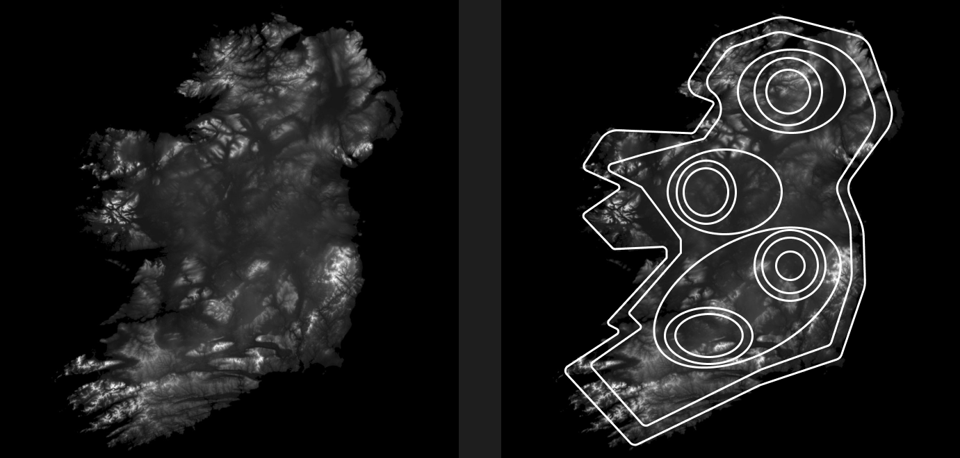
As a fun bonus/side project, I got to work with one of the research scientists to create topographic maps that be used within the minimap that was within the simulation. Since the terrains for all the trials were created using Unity's built-in terrain tool, we were able to export the terrains into .raw files. These .raw files were then converted to .png files to be processed in MatLab.
Within Matlab, my supervisor processed the images into numbers referencing the "height" of each point in the image and we made a simple algorithm that parsed through the image, analyzing the difference between each number with a constant step size; if the difference was greater than the step size, it would place a dot for that height, and repeat on the next difference threshold. Each image was parsed 4 times; one for each side, and then combined to create the final map.
Learnings and Reflection
Creating a user experience that doesn't compromise experimental standardization
One of the biggest challenges of designing game levels for research purposes was the balance needed between user experience and collecting good research data. In an ideal state, I would be able to cater features to users but that would lead to the addition of too many variables, potentially compromising the data. This meant I had to find the sweet spot where the flow of the simulation and its tasks were intuitive, and the data being collected was also able to be used effectively and gather actual results.
The user interviews and testing were also an essential part of the project, not only due to the great insights I received, but also because of the empathy aspect. After the sessions, I felt like I knew a lot more about the psychology around field operations and thus did my best to make the experience as enjoyable as possible while not breaking the immersion of the game.