Lab Rebrand - revamping WSIB's innovation lab identity
At a glace
Context
The scope of the project included the redesign of brand assets, the website, internal and external slide decks, and social media across the entire innovation lab.
Problem statement
How might we revamp the Lab's brand to better reflect its values, projects, and environment while still staying rooted as a part of corporate WSIB?
Value proposition
Rebranding the lab allows external parties to better grasp the lab's values, projects, and environment. Internally, it helps build cohesion across lab assets by setting clear guidelines for use cases and styles.
Team
- 5 designers (including me)
- 2 supervisors (our design lead and the lab's innovation activator)
Functions
- Accessibility
- Visual Design
- Brand Identity
- Mockups and Prototyping
Expected impacts
- a brand that better showcases the lab and its values
- easier to identify the lab's work and social presence
- sets precedent for future material to maintain consistency across the lab
Research and Project Scoping
Analyzing current perceptions and determining the vision of the lab
First thing on the agenda was figuring out the best way to approach the rebrand. Who better than the head of the lab to get that info! The design team spoke with the lab's innovation activator about the vision, goals, and constraints for this project. We also sent out a survey to current members and alumni of the lab to capture insights about their experience with lab's brand, both during their time at the lab and when applying. We compiled and documented our findings and listed the key insights that would define success for this project.
Key Insights
Long lasting - ensuring a timeless design that is future forward
Tethered to corporate - recognizable that the lab is still apart of WSIB
Sustainable - easy management of assets and visuals that can be scaled across cohorts
Cohesion - consistency and clarity across all internal and external facing lab material
Vision - expressing the lab's presence as creative, logical, and collaborative
After sorting out the milestones the team planned to achieve, we ordered them based on priority and developed a Gantt chart to document and track our progress, as well as noting sprint periods and establishing weekly syncs (noted with the red flags) to provide updates to our stakeholders and gain feedback.

Initial Explorations and Brainstorming
Exploring any and every design, all at once
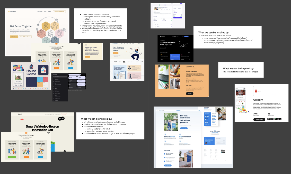
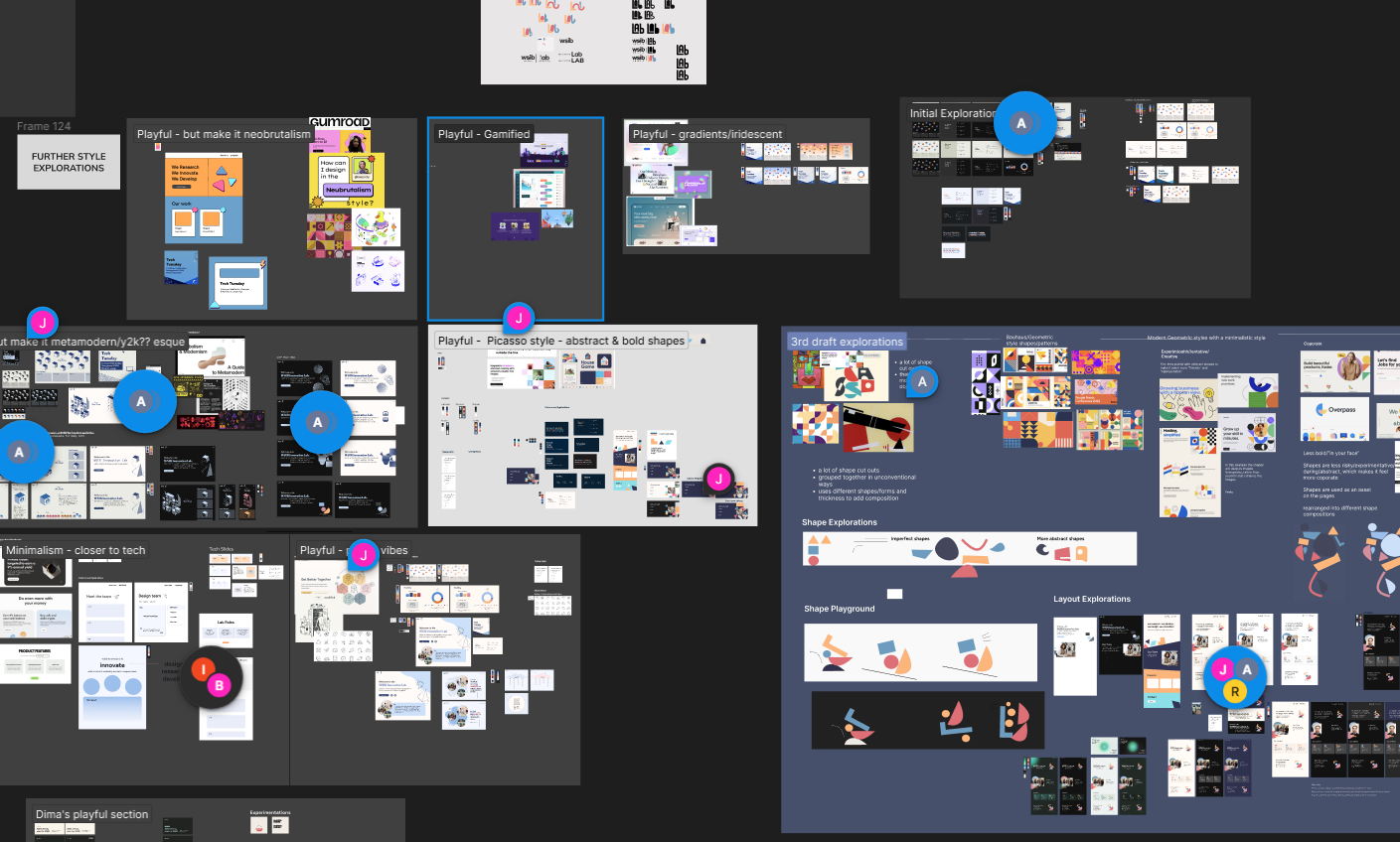
The first course of action was to explore; we looked at other innovation labs, different brand aesthetics, WSIB and other insurance boards, and compiled everything in a (slightly messy) Figma page. We put notes on areas that we thought would fit the lab's vision and highlighted any parts that we found interesting and worth diving into further.
Typography, Iconography, and Colours
Laying the foundation and building blocks of the rebrand
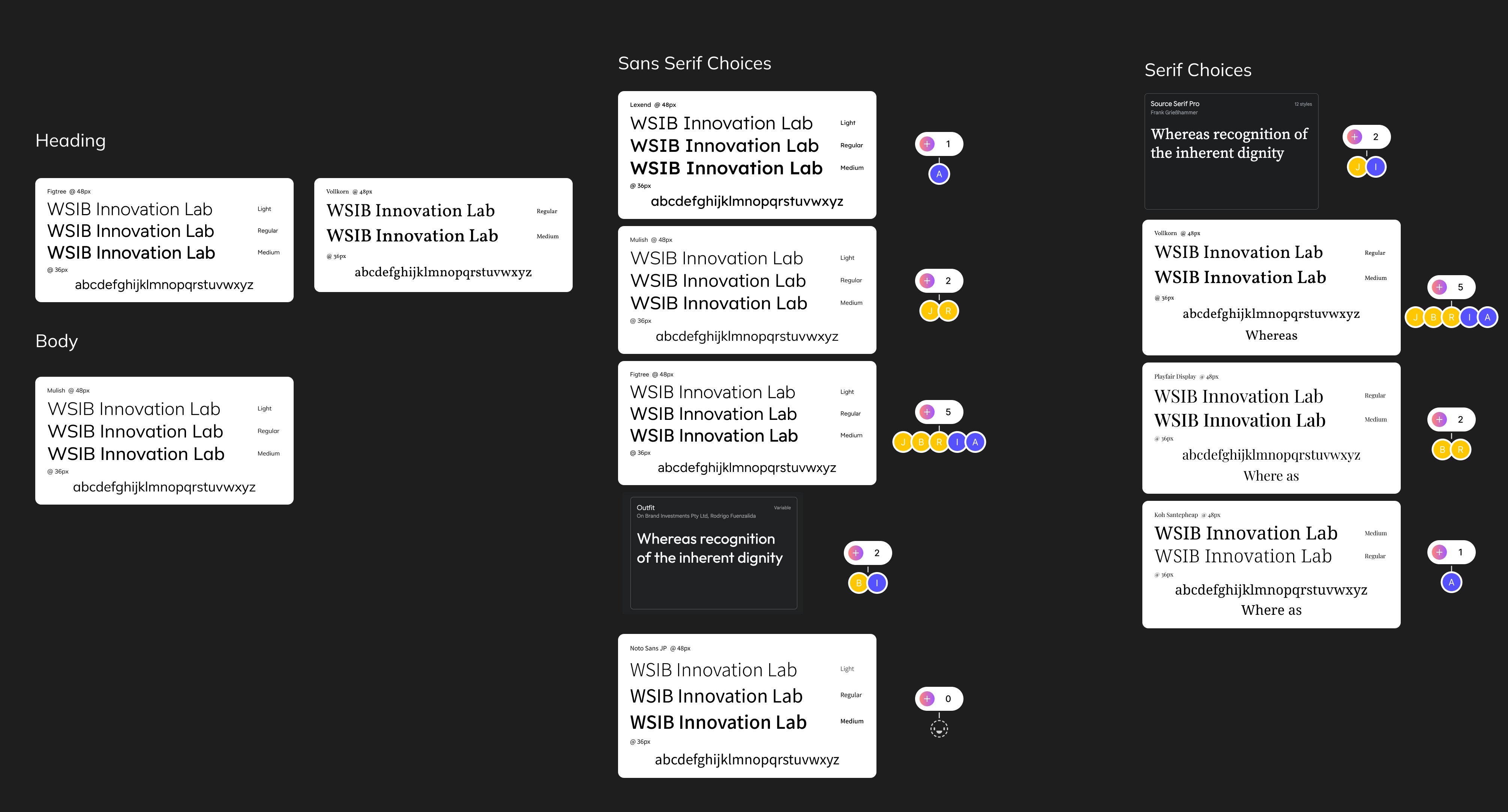
After compiling our initial explorations and sorting them out into sections we thought worked well together, we started working on establishing the typography, iconography and colours. The design team compiled a variety of variants for each respective section and began testing them in combinations to see what stuck. After a lot of deliberations, mixing and matching, we decided on our final typography, iconography, and colours.
Iconography was the easiest to decide, to keep things organized and easier for future cohorts, we went with Google Material Design Icons; they're sustainable, have many different variants and meet universal standards for icons. For the typography, we chose to have 3 fonts; 2 sans-serif and 1 serif. Originally, the plan was to have 3 sans-serif fonts, but we found that having a serif option was great for adding emphasis and giving our designs an overall "flair". We chose Mulish for the body font, as it's the main font of corporate WSIB, and paired it alongside Figtree (regular) and Fraunces (soft, bolded) for the headers.
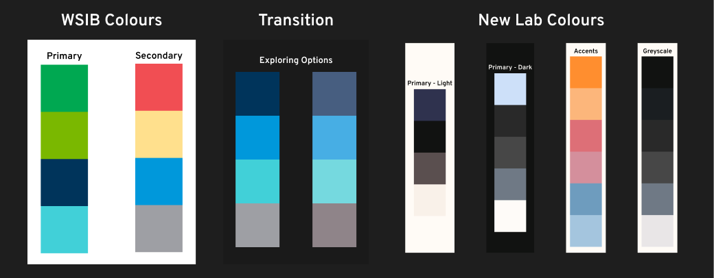
Determining colours definitely took the longest; we went through many different colour schemes but ultimately decided on a palette that was loosely based on the primary colours of corporate WSIB. We looked at WSIB's colour palette and looked at different tints, shades, and tones to create new primary colours for the lab. We settled on variants of blue as the lab's main colour, as it was easier to work with for colour and contrast accessibility in comparison to green. Afterwards, we paired up the blues with secondary colours and accents for light and dark modes to give the lab its own unique look, while still maintaining rooted within WSIB. We also examined the colour contrast for different pairings to ensure all use cases met WCAG AA or AAA standards.
Visuals, Logos, and Styles
Mixing it all together to create a mosaic for the ages (hopefully)
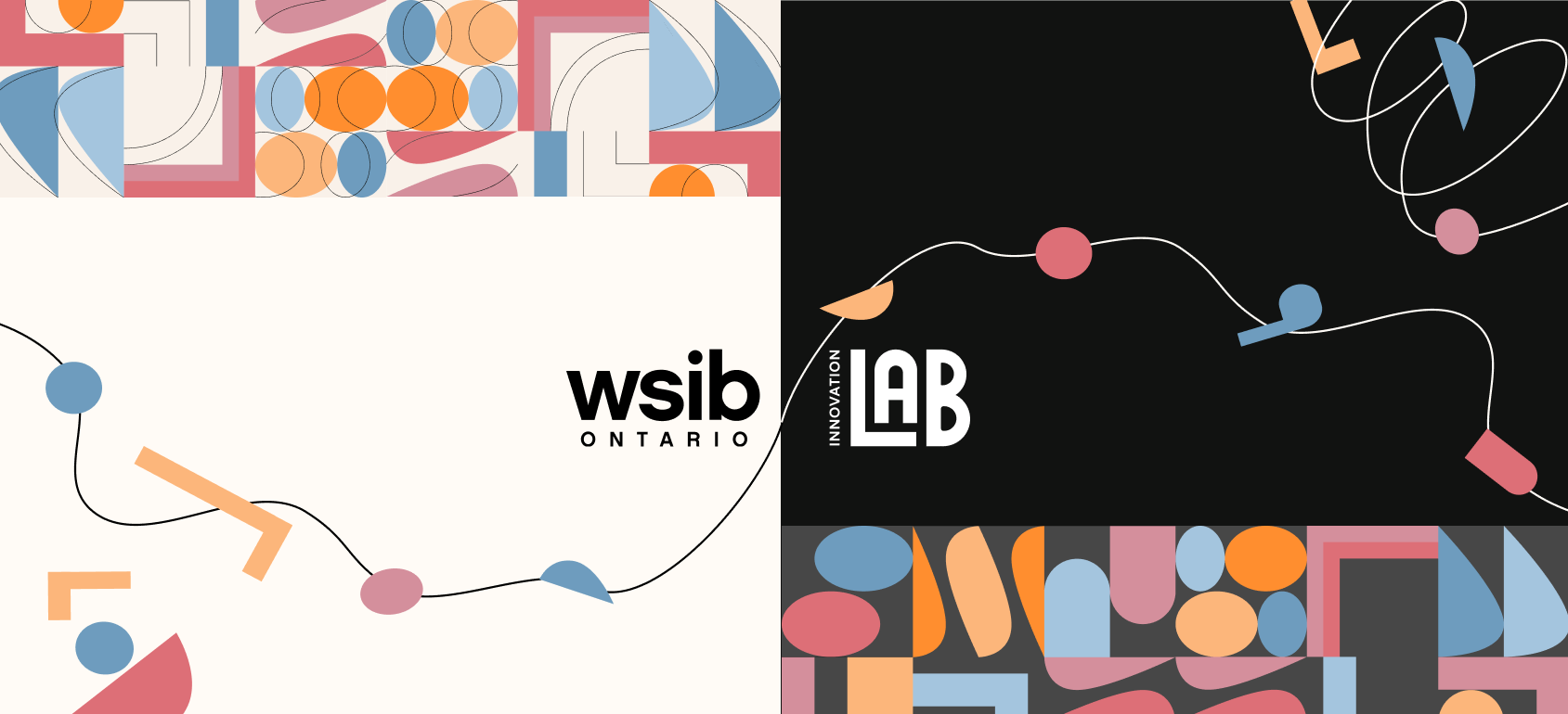
In my opinion, the hardest part of the rebrand was finalizing the overall visuals and style to be implemented. We explored many different visual styles (neobrutalism, metamodernism, minimalism, to name a few), and ultimately decided on a pastel-picasso style, with some bauhaus and moving line accents.
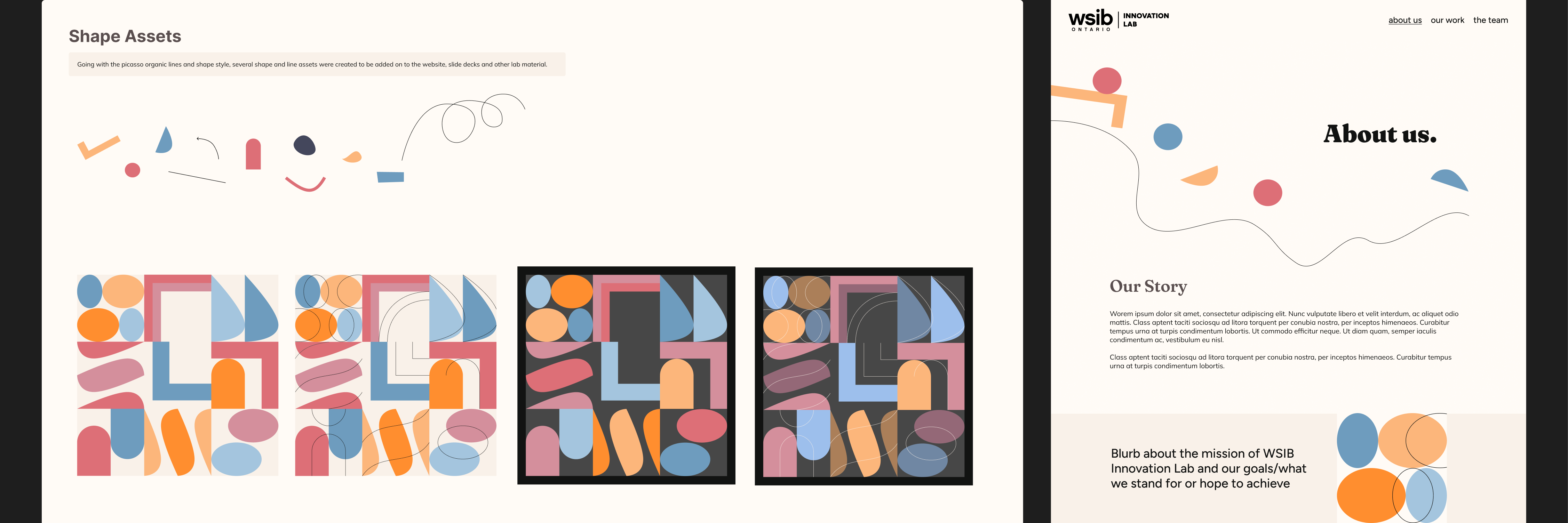
Ultimately, we decided on a pastel-picasso style, with some bauhaus and dynamic line accents, as we felt they captured the lab's values really well; the dynamic lines show that the lab is always in motion, whether that be the projects and proof of concepts we develop, our sprints, or the overall growth that happens in the lab. The bauhaus tiles show how the lab often starts with abstract ideas and concepts and works make them unified, and the pastel-picasso aesthetics demonstrate the lab's playful side, because innovation starts with curiosity and, well, having fun!
Logo ideation was a bit difficult due to some restrictions; the logo needed to work alongside the corporate WSIB logo, so visual balance and sizing of elements was really important. We decided to have two logos; one that would only be paired with the corporate WSIB logo, and an alternate one that could be used with the corporate logo, or as a standalone.

Brand Assets
Creating a home for our designs
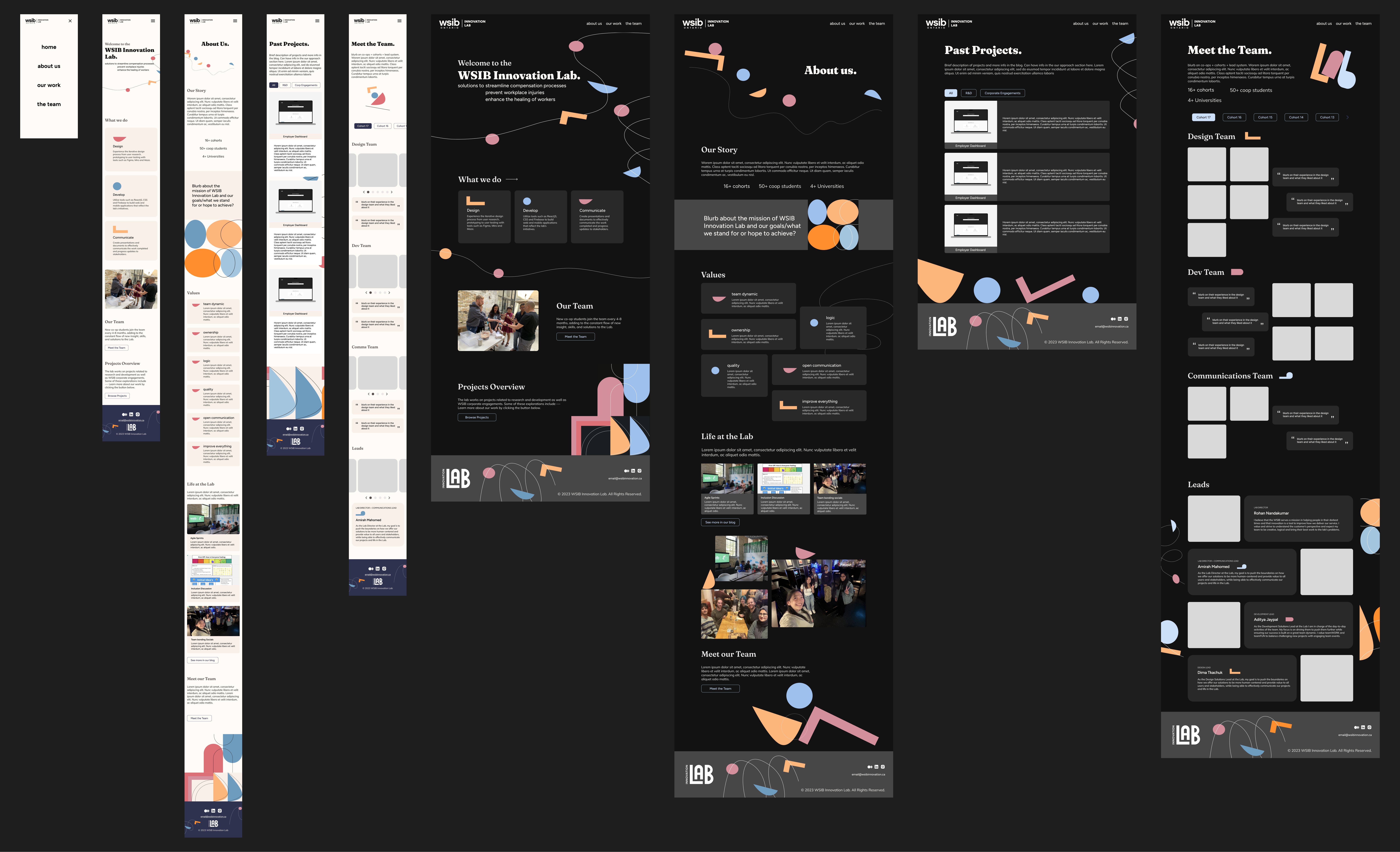
With the styling and visuals complete, next on the agenda was to create a new website and other brand assets to match. Since we did most of the lo-fi/exploration work earlier, we had a good idea of what we wanted for the hi-fi mockups. First, we sorted out the information architecture for the new site using feedback from our earlier survey.

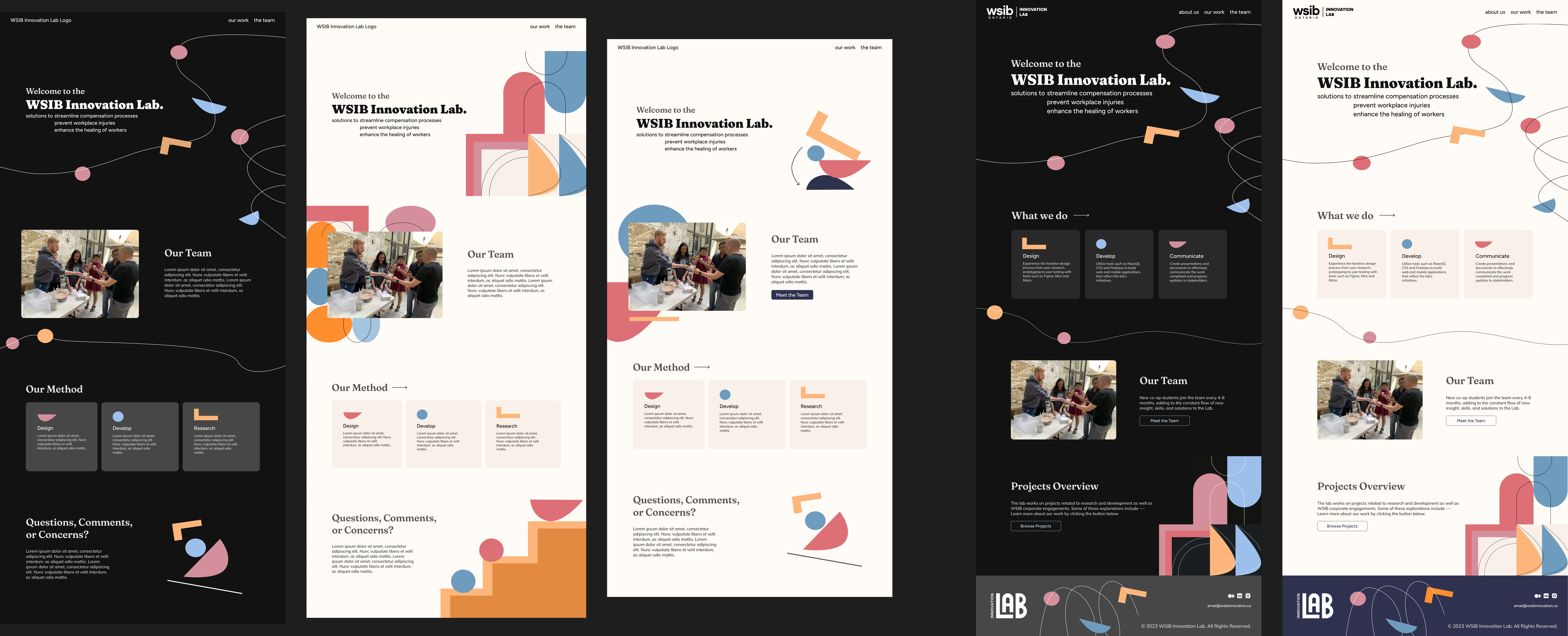
Afterwards, we drafted some different designs for each of the pages and made some final touches to develop our completed mockups for desktop, tablet, and mobile views. After completing the prototypes for the designs, we finished the lab rebrand!
Next Steps, Reflection, and Learnings
Looking back and wrapping up (a present for the next cohort)
After cleaning up our Figma pages, documentation, and style guides, the team also looked into low/no-code solutions such as Framer and Webflow to lessen the burden on our development team. Leveraging low/no-code solutions had a lot of benefits: it would allow the design team to cover the majority of work to maintain the website, such as pushing updates to projects and cohorts, as well as allow the possibility to create proof of concepts without needing extensive resources from the development team. The next steps we noted were making the designs live, as well as implementing the new sections of the website that were listed in the information architecture.
Reflecting back on this project, it definitely had a lot of firsts; the team had a lot of creative freedom and the ability to explore different designs; I thought we did quite well in general, but one thing I would've done differently would be to establish what we wanted out of the designs at first and then explored what features and styles we could use afterwards. I think we did a really good job at justifying the final decisions we made, but we often had a variety of designs first, and then tried to pick and choose aspects and see if we could fit certain themes to them, by having a more definitive list I think we could've differentiated the more feasible designs faster which would've also helped when we were deliberating which direction to go.