Spotify Mobile - analyzing biomechanics and community features
At a glace
Context
Spotify is my most used mobile app and a mobile app I enjoy using. This case study looks into some of the pain points I’ve experienced using Spotify over the years and some possible solutions to them.
Problem statement
How might we improve Spotify's community and lyric features to create a more streamlined and cohesive experience for users?
Value proposition
Improving the swipe interactions improves the user experience by reducing frustrations caused by the ambiguity of the swipe function. The addition of more prominent marketplace features benefits Spotify and artists through increased exposure which can help improve sales for events and merch.
Team
- 1 product designer (me)
Functions
- Accessibility
- Interaction Design
- Brand & Product Thinking
Expected impacts
- no ambiguity when swiping through music
- faster response time and more lenient inputs for concurrent swipes
- increased revenue and incentives for artists to create more merchandise and host events

User Testing and Needs Assessment
Putting your playlist on shuffle but scrolling through all the songs
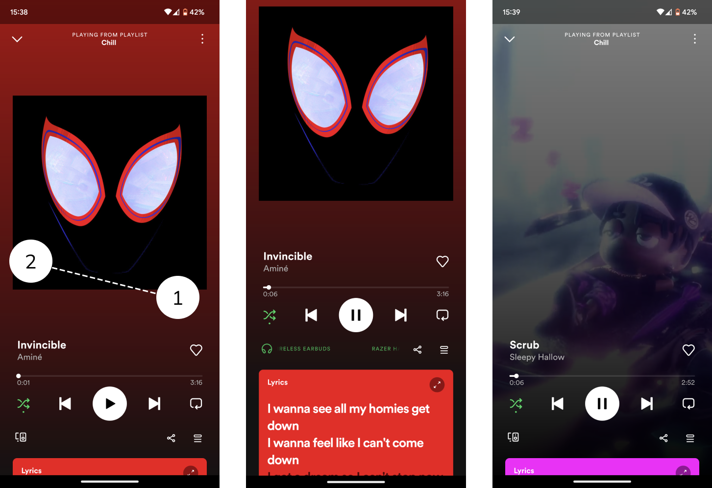
In order to do some user testing and find out the difficulty of swiping through music, I sat down with some of my roommates and just got them to try and swipe through music on Spotify with and without looking at the screen and looked at their thumb movements. The motion of thumbs moved with a slight angle as users swiped quickly, especially while looking away, which led to inputs in both the vertical and horizontal direction, causing ambiguity when the program determines whether to move to the next song or show the lyrics. This can be seen in the image below, where a slightly slanted swipe leads to the second image, where the lyric tab slightly pulls up instead of the third image where a new song is played.

Mockups and Prototyping
Dropping the mic (onto the screen)

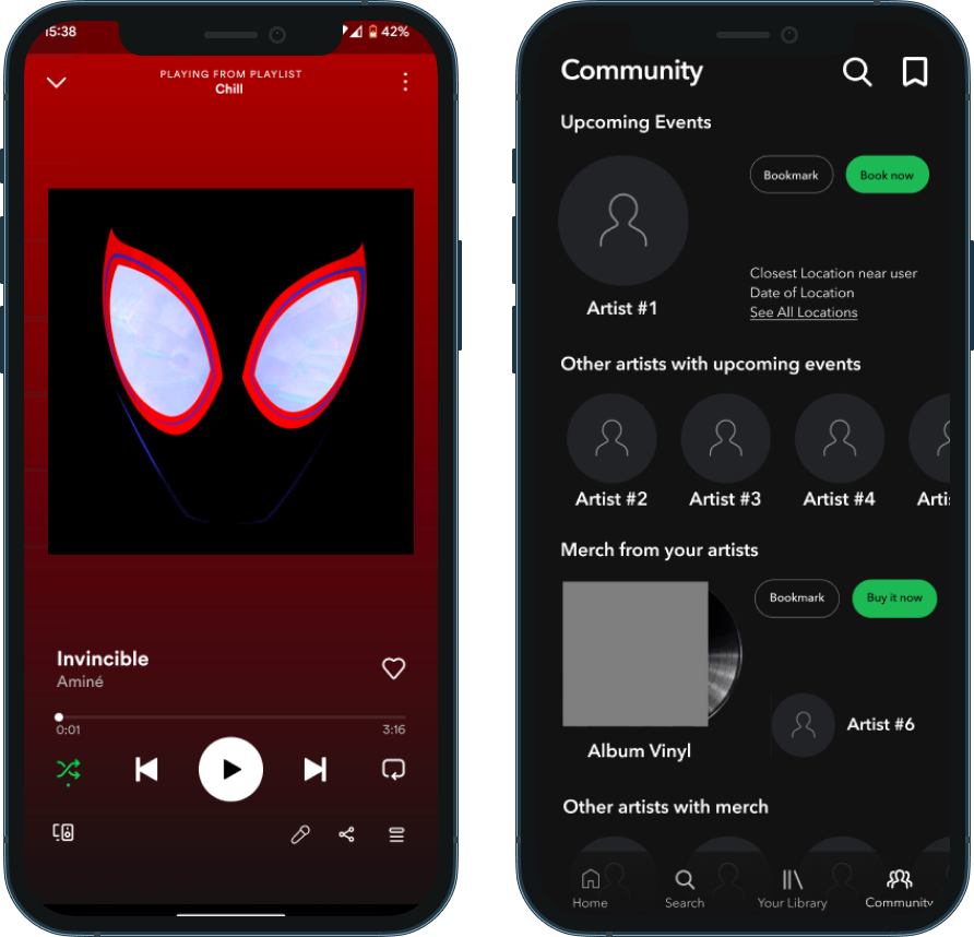
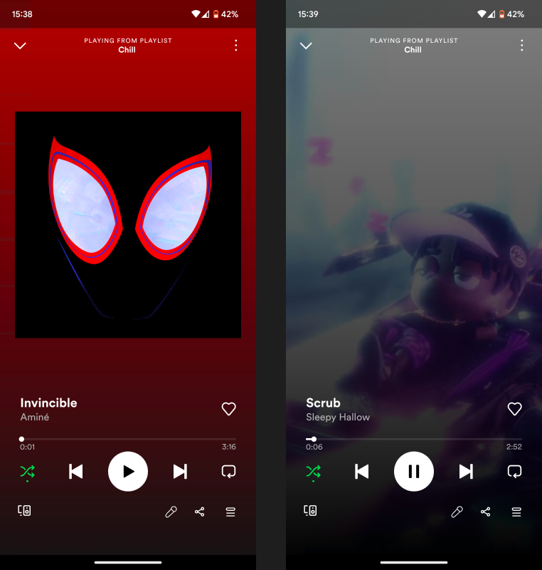
Using some inspiration from the desktop application, the new proposed design used the same microphone icon at the bottom of the screen for the mobile application for lyrics to avoid this clash when swiping. This button will still pull up the same lyric tab, but won’t interfere with any swiping motions done by the user to change songs.
Some of the tradeoffs associated with the new design are the space constraints with the addition of a new button and a shift in functionality from a swipe to a button. The addition of the lyric button may clash with the audio device indicator located on the left side of the bar. However, since Spotify already implements a scrolling text feature on this component, it can be further offset to allow space for the lyric button, allowing for clearer functions for lyrics without the information provided by the scrolling text being compromised. The shift in functionality by using a button may lead to a clash with muscle memory for more experienced users, but the button is justified since the current system has an ambiguous function for swipes that are not perfectly horizontal, which is more detrimental in the long term than having users adapt to a new, more streamlined system. I also made a simple prototype to show this feature, which you can see here!
Marketplace and Community Features
Putting artists in the spotlight

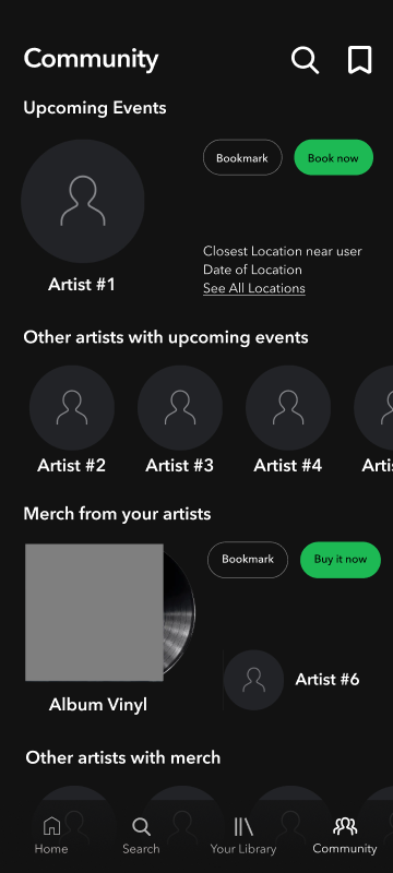
The current system for finding merchandise and events is hard to find and doesn’t provide much information, therefore, it is proposed to have an extra tab at the bottom of the screen to allow for a dedicated community space for information about concerts, merchandise, and other events that artists may be promoting.
As seen in the mockup, a new community tab can feature concerts and merchandise by artists followed by users, with additional content curated based on recent listens, similar genres, and similar artists just like how Spotify's current home page provides recommendations for new content. Users can also bookmark events and access them using the top right bookmark button, and search for particular artists or events using the community-specific search function at the top. The buy buttons take users to websites with more information; for events and concerts, this would be Ticketmaster or a dedicated event page if there are multiple artists, and for merch, this would be the Spotify shop.
Keeping it consistent with Spotify’s home page, each horizontal section can be swiped through to expose additional content, in this case, more concerts and merch. One of the possible risks of implementing these features more prominently is that users who are not interested in such content may be flooded with new content that they are not interested in, degrading the user experience. For this reason, a new tab was proposed instead of adding a horizontal section on the home page, so users who would like more engagement with artists through concerts and merchandise can use the new tab, while those who prefer to stick to Spotify's main features can simply ignore it.
Learnings and Reflection
Body mechanics and mobile spacing are an interesting recipe
I found it super interesting that minor body mechanics can heavily factor in the practicality of a design since, in theory, swiping vertically and horizontally are completely different and therefore would not lead to any clashes, but in reality that’s not the case due to how our bodies naturally interact with devices. This insight was extremely useful in designing my projected solution for the lyric button.
When designing a concept for a community tab, I found myself lacking space for all the features I originally wanted to input. For example, I was planning to include short descriptions for merchandise and all the upcoming event locations, but there just wasn’t enough space to adequately input the info without leading to visual clutter and an overall lack of clarity. After taking some time to explore other tabs on the Spotify app, I realized that succinct, high-level information is really all you can fit without overwhelming the user, and using links to pages with more detail is a good way to provide a comprehensive view of the product without showing it all at once, like how Spotify’s current “buy now” button for merchandise takes you to the web browser shop, which provides more detail about the merch.